Coherency analysis of fMRI data
The fMRI data-set analyzed in the following examples was contributed by Beth Mormino. The data is taken from a single subject in a “resting-state” scan, in which subjects are fixating on a cross and maintaining alert wakefulness, but not performing any other behavioral task.
The data was pre-processed and time-series of BOLD responses were extracted from different regions of interest (ROIs) in the brain. The data is organized in csv file, where each column corresponds to an ROI and each row corresponds to a sampling point.
In the following, we will demonstrate some simple time-series analysis and visualization techniques which can be applied to this kind of data.
We start by importing the necessary modules/functions, defining the sampling_interval of the data (TR, or repetition time) and the frequency band of interest:
import os

#Import from other libraries:
import numpy as np
import matplotlib.pyplot as plt

import nitime
#Import the time-series objects:
from nitime.timeseries import TimeSeries
#Import the analysis objects:
from nitime.analysis import CorrelationAnalyzer, CoherenceAnalyzer
#Import utility functions:
from nitime.utils import percent_change
from nitime.viz import drawmatrix_channels, drawgraph_channels, plot_xcorr

#This information (the sampling interval) has to be known in advance:
TR = 1.89
f_lb = 0.02
f_ub = 0.15
We use Numpy to read the data in from file to a recarray:
data_path = os.path.join(nitime.__path__[0], 'data')

data_rec = np.genfromtxt(os.path.join(data_path, 'fmri_timeseries.csv'),
                         names=True, delimiter=',')
This data structure contains in its dtype a field ‘names’, which contains the first row in each column. In this case, that is the labels of the ROIs from which the data in each column was extracted. The data from the recarray is extracted into a ‘standard’ array and, for each ROI, it is normalized to percent signal change, using the utils.percent_change function.
#Extract information:
roi_names = np.array(data_rec.dtype.names)
n_samples = data_rec.shape[0]


#Make an empty container for the data
data = np.zeros((len(roi_names), n_samples))

for n_idx, roi in enumerate(roi_names):
    data[n_idx] = data_rec[roi]

#Normalize the data:
data = percent_change(data)
We initialize a TimeSeries object from the normalized data:
T = TimeSeries(data, sampling_interval=TR)
T.metadata['roi'] = roi_names
First, we examine the correlations between the time-series extracted from different parts of the brain. The following script extracts the data (using the drawmatrix_channels function, displaying the correlation matrix with the ROIs labeled.
# Initialize the correlation analyzer
C = CorrelationAnalyzer(T)

# Display the correlation matrix
fig01 = drawmatrix_channels(C.corrcoef, roi_names, size=[10., 10.],
                            color_anchor=0)
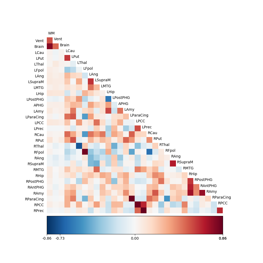
Notice that setting the color_anchor input to this function to 0 makes sure that the center of the color map (here a blue => white => red) is at 0. In this case, positive values will be displayed as red and negative values in blue.
We notice that the left caudate nucleus (labeled ‘lcau’) has an interesting pattern of correlations. It has a high correlation with both the left putamen (‘lput’, which is located nearby) and also with the right caudate nucleus (‘lcau’), which is the homologous region in the other hemisphere. Are these two correlation values related to each other? The right caudate and left putamen seem to have a moderately low correlation value. One way to examine this question is by looking at the temporal structure of the cross-correlation functions. In order to do that, from the CorrelationAnalyzer object, we extract the normalized cross-correlation function. This results in another TimeSeries object, which contains the full time-series of the cross-correlation between any combination of time-series from the different channels in the time-series object. We can pass the resulting object, together with a list of indices to the viz.plot_xcorr function, which visualizes the chosen combinations of series:
xc = C.xcorr_norm

idx_lcau = np.where(roi_names == 'LCau')[0]
idx_rcau = np.where(roi_names == 'RCau')[0]
idx_lput = np.where(roi_names == 'LPut')[0]
idx_rput = np.where(roi_names == 'RPut')[0]

fig02 = plot_xcorr(xc,
                   ((idx_lcau, idx_rcau),
                    (idx_lcau, idx_lput)),
                   line_labels=['RCau', 'LPut'])
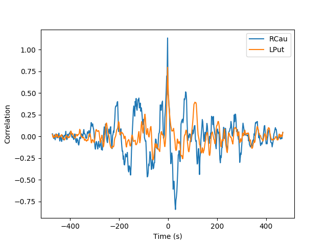
Note that the correlation is normalized, so that the the value of the cross-correlation functions at the zero-lag point (time = 0 sec) is equal to the Pearson correlation between the two time-series. We observe that there are correlations larger than the zero-lag correlation occurring at other time-points preceding and following the zero-lag. This could arise because of a more complex interplay of activity between two areas, which is not captured by the correlation and can also arise because of differences in the characteristics of the HRF in the two ROIs. One method of analysis which can mitigate these issues is analysis of coherency between time-series [Sun2005]. This analysis computes an equivalent of the correlation in the frequency domain:
Because this is a complex number, this computation results in two quantities. First, the magnitude of this number, also referred to as “coherence”:
This is a measure of the pairwise coupling between the two time-series. It can vary between 0 and 1, with 0 being complete independence and 1 being complete coupling. A time-series would have a coherence of 1 with itself, but not only: since this measure is independent of the relative phase of the two time-series, the coherence between a time-series and any phase-shifted version of itself will also be equal to 1.
However, the relative phase is another quantity which can be derived from this computation:
This value can be used in order to infer which area is leading and which area is lagging (according to the sign of the relative phase) and, can be used to compute the temporal delay between activity in one ROI and the other.
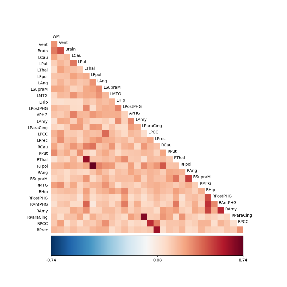
First, let’s look at the pair-wise coherence between all our ROIs. This can be done by creating a CoherenceAnalyzer object.
C = CoherenceAnalyzer(T)
Once this object is initialized with the TimeSeries object, the mid-frequency of the frequency bands represented in the spectral decomposition of the time-series can be accessed in the ‘frequencies’ attribute of the object. The spectral resolution of this representation is the same one used in the computation of the coherence.
Since the fMRI BOLD data contains data in frequencies which are not
physiologically relevant (presumably due to machine noise and fluctuations in
physiological measures unrelated to neural activity), we focus our analysis on
a band of frequencies between 0.02 and 0.15 Hz. This is easily achieved by
determining the values of the indices in C.frequencies and using those
indices in accessing the data in C.coherence. The coherence is then
averaged across all these frequency bands.
freq_idx = np.where((C.frequencies > f_lb) * (C.frequencies < f_ub))[0]
The C.coherence attribute is an ndarray of dimensions \(n_{ROI}\) by \(n_{ROI}\) by \(n_{frequencies}\).
We extract the coherence in that frequency band, average across the frequency bands of interest and pass that to the visualization function:
# Averaging on the last dimension:
coh = np.mean(C.coherence[:, :, freq_idx], -1)
fig03 = drawmatrix_channels(coh, roi_names, size=[10., 10.], color_anchor=0)
We can also focus in on the ROIs we were interested in. This requires a little bit more manipulation of the indices into the coherence matrix:
idx = np.hstack([idx_lcau, idx_rcau, idx_lput, idx_rput])
idx1 = np.vstack([[idx[i]] * 4 for i in range(4)]).ravel()
idx2 = np.hstack(4 * [idx])

coh = C.coherence[idx1, idx2].reshape(4, 4, C.frequencies.shape[0])
Extract the coherence and average across the same frequency bands as before:
coh = np.mean(coh[:, :, freq_idx], -1) # Averaging on the last dimension
Finally, in this case, we visualize the adjacency matrix, by creating a network graph of these ROIs (this is done by using the function drawgraph_channels which relies on networkx):
fig04 = drawgraph_channels(coh, roi_names[idx])
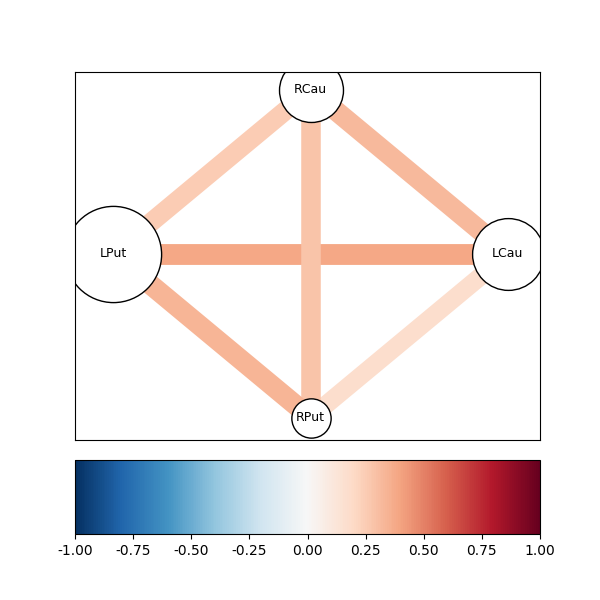
This shows us that there is a stronger connectivity between the left putamen and the left caudate than between the homologous regions in the other hemisphere. In particular, in contrast to the relatively high correlation between the right caudate and the left caudate, there is a rather low coherence between the time-series in these two regions, in this frequency range.
Note that the connectivity described by coherency (and other measures of functional connectivity) could arise because of neural connectivity between the two regions, but also due to a common blood supply, or common fluctuations in other physiological measures which affect the BOLD signal measured in both regions. In order to be able to differentiate these two options, we would have to conduct a comparison between two different behavioral states that affect the neural activity in the two regions, without affecting these common physiological factors, such as common blood supply (for an in-depth discussion of these issues, see [Silver2010]). In this case, we will simply assume that the connectivity matrix presented represents the actual neural connectivity between these two brain regions.
We notice that there is indeed a stronger coherence between left putamen and the left caudate than between the left caudate and the right caudate. Next, we might ask whether the moderate coherence between the left putamen and the right caudate can be accounted for by the coherence these two time-series share with the time-series derived from the left caudate. This kind of question can be answered using an analysis of partial coherency. For the time series \(x\) and \(y\), the partial coherence, given a third time-series \(r\), is defined as:
In this case, we extract the partial coherence between the three regions,
excluding common effects of the left caudate. In order to do that, we generate
the partial-coherence attribute of the CoherenceAnalyzer object, while
indexing on the additional dimension which this object had (the coherence
between time-series \(x\) and time-series \(y\), given time series \(r\)):
idx3 = np.hstack(16 * [idx_lcau])
coh = C.coherence_partial[idx1, idx2, idx3].reshape(4, 4, C.frequencies.shape[0])
coh = np.mean(coh[:, :, freq_idx], -1)
Again, we visualize the result, using both the viz.drawgraph_channels()
and the drawmatrix_channels() functions:
fig05 = drawgraph_channels(coh, roi_names[idx])
fig06 = drawmatrix_channels(coh, roi_names[idx], color_anchor=0)
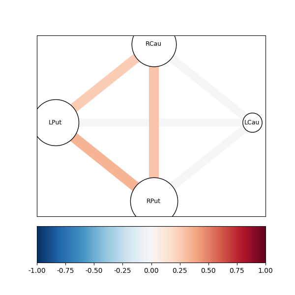
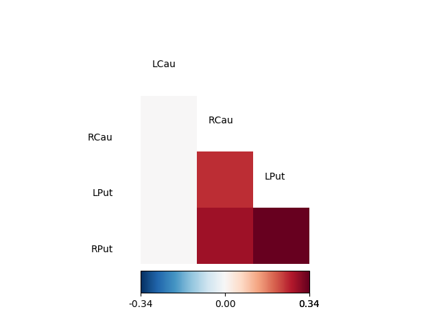
As can be seen, the resulting partial coherence between left putamen and right caudate, given the activity in the left caudate is smaller than the coherence between these two areas, suggesting that part of this coherence can be explained by their common connection to the left caudate.
XXX Add description of calculation of temporal delay here.
We call plt.show() in order to display the figures:
plt.show()
| [Sun2005] | F.T. Sun and L.M. Miller and M. D’Esposito(2005). Measuring temporal dynamics of functional networks using phase spectrum of fMRI data. Neuroimage, 28: 227-37. |
| [Silver2010] | M.A Silver, AN Landau, TZ Lauritzen, W Prinzmetal, LC Robertson(2010) Isolating human brain functional connectivity associated with a specific cognitive process, in Human Vision and Electronic Imaging XV, edited by B.E. Rogowitz and T.N. Pappas, Proceedings of SPIE, Volume 7527, pp. 75270B-1 to 75270B-9 |
Example source code
You can download the full source code of this example.
This same script is also included in the Nitime source distribution under the
doc/examples/ directory.